Here’s some advocacy for black and white outdoor photography. Personally I think B&W photos can be just as striking as the color photos often done by most outdoor enthusiasts.
Note: I am not a professional photographer. Just an enthusiastic amateur who enjoys photography as something that supplements my love for the outdoors. This just my opinion…take it for what it is worth. 🙂
Also, technically I am discussing “monochromatic photography”. Since most people, myself included, use B&W photography as a generic name for this type of photography, I will too. ![]() Though technically incorrect, B&W is a label understood by most people more readily for this type of photography.
Though technically incorrect, B&W is a label understood by most people more readily for this type of photography.
Black and White Portraits
Black and White (B&W) photos are often used for portrait photography. B&W (or its closely related cousin – sepia tone) evoke a certain drama and mood. Effects are more heightened and the eye is more drawn to the subject matter.
The album photo for Spirit by Willie Nelson really is evocative of the album itself. A great album (and one you really should listen to) that is about heartbreak, loss, regret and (ultimately) acceptance…I don’t think a color photo of Willie Nelson would have the same effect on a person about to listen to the album.

One look at the album cover and you see the craggy and worn face. The sorrowful and intense eyes looking back. You know what the album is about. Somehow I don’t think a color photo would evoke the same emotion and thoughts.
It is a stylistic and aesthetic choice that works really well for certain situations and emotions when it comes to photography.
Black and White for the Outdoors
As striking as a medium B&W photography can be for portrait photography, it seems to be used less for outdoor photography.
At first glance, easy to see why. Wildflowers, sunsets, deep blue lakes and deep greens of the forests seem to call out for the use of color.
By not making use of B&W photography, there are limits with what a photographer can do with a given scene.
Personally, I find B&W works well for:
- Low-light conditions typically found during overcast days
- When the light is “flat” and the contrast is naturally low
- When the natural colors are gray, brown or white to begin with
- For winter photography
- When the landscape is mainly rock, ice and/or snow
Many of my winter photos are in B&W for the reasons listed above.
The B&W tones really bring out the beauty of the stark landscape.
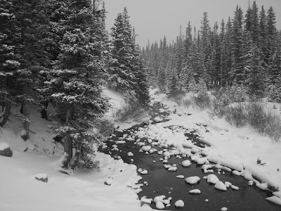
A color photo of this scene from Brainard Lake Recreation Area would not be as evocative of the winter landscape:
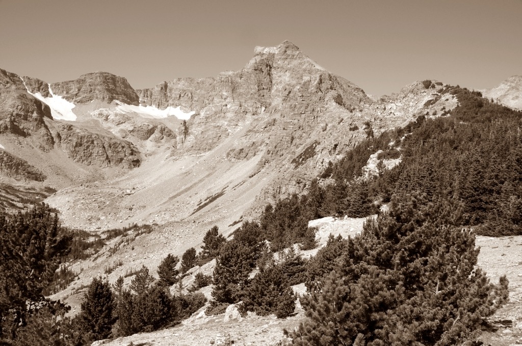
Likewise this scene from Knapsack Col in The Winds. In many ways, this high alpine terrain is naturally almost devoid of color. On the overcast day I took this photo, the sepia tones really brought out the glacier, rock and ice:

For poor lighting conditions, I find B&W photography turns what can be a lackluster photo in something memorable and even beautiful.
Here are two scenes that normally would not look good in color.
In the first scene, the sun is behind the cottonwood, it is late morning/early afternoon, the lighting is terrible and the tree would be washed out in a color photo:

In B&W? It seems to bring out the feelings of hiking on a cold, windy November day. The scene looks chilly, cold and remote. Fall is ending and winter is about to begin.
In a similar vein, this photo from my friend Mark on Lookout Mountain looked terrible in color. The sun was behind him and the color was washed out. In B&W? The photo seems to evoke the feelings we had about this summit block: This obscure peak has an amazing finish with awesome views. I can’t believe how few people hike it!

Ultimately, it is an aesthetic issue. I find that what can be a pretty, but nothing special, scene looks more dramatic when in this format. The B&W photos bring out the richness and subtlety in some scenes.
Here’s a photo from the Pawnee Buttes in northeast Colorado. A subtle landscape that really works well with B&W or sepia tone photography:
The first image is in color. I think it looks nice:
But I think my second photo is more dramatic even though they are both the same photo:
B&W or Sepia Tone?
Though very closely related, Sepia Tone and B&W photos evoke different emotions and moods in a scene.
B&W produces more striking photos that seem to work well when there is naturally a high contrast area such as what is often found in high alpine environments during certain lighting conditions.

Because B&W is striking, it works really well for bringing out fine details in such things as signs, wood grains, rocks and so on.

So why use sepia tone?
Sepia tone produces a warmer tone that is less striking and intense than black and white. Besides creating an almost vintage look, it seems to add a majestic feel to a scene.

Sepia Tone also seems to work well on a foggy day. The scenery around the objects looks almost mystical.

What to use?
If you decide that you want to take a stab at non-color photography, I think it is better to shoot in color and then edit the photo after. All photos, even ones shot in .JPG format, are un-finished photos in my opinion. Even in the best of photos, there are minor to major tweaks to be done. Best to tweak the photos on a computer than in the more limited controls of a camera. Think this especially true for non-color photography.
Here are some popular software products for photo editing. I wrote about them before in a previous article.
- IrfanView – I love this freeware program for uber-simple edits and batch resizing. Windows based.
- Photoshop – The most well know and full featured photo editing software. Good if you really want to tweak and/or create more ‘artsy’ photos. Very complex program and $$$$. For Mac and Windows
- Photoshop Elements – I think of this program as Photoshop Lite. Less $$$ and complex, has good features for the hobbyist. For Mac and Windows.
- GIMP – An open source alternate to Photo Shop. Powerful, but a bit rough around the edges compared to PhotoShop. For geeks (who me? 🙂 ) the free price, features and ability to run on different platforms makes it a good alternative to PS. Runs on Linux, Mac and Windows
- Photoscape – A simple, easy to use but surprisingly powerful photo editing software suite. It’s not Photoshop (or even GIMP), but sometimes less really is more. For Windows. Freeware.
With photo editing software, it is really easy to make color and B&W copies of scenes to compare and contrast. Take the photos, tweak, experiment and have fun!
And finally
I really think outdoors people are missing out by not making better use of B&W style photography. What is a so-so photo can look amazing in B&W. And sometimes the best photos are in B&W! With digital cameras and low cost (or free!) photo software, it is very easy for a hobbyist to make some nice photos that are B&W. The striking contrast, the emotions evoked and just how wonderful B&W photography can capture a scene make this type of photography useful. By using B&W photography, an outdoors person can really capture all the aspects of the outdoor experience.

Including love and romance. I hope my friends don’t mind me using one of my favorite photos of them as an example. 🙂